
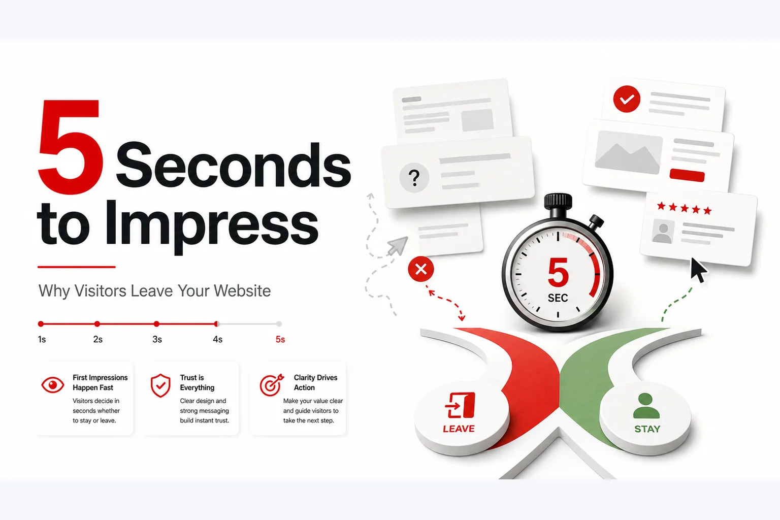
Article summary
- Learn why first impressions matter on your website and how to reduce bounce rate with simple trust-building improvements.
- Most visitors decide quickly whether your website feels trustworthy, clear, and worth exploring. Learn what they notice first, why they leave, and how to improve your first impression website with simple, practical changes.
- Audience: small business owners.
- Why first impressions matter online
- A first impression website has only a few seconds to show a visitor that your business is real, clear, and worth their time. Nielsen Norman Group explains that the first 10 seconds are critical and that users often leave pages within 10-20 seconds when the value proposition is not clear (Nielsen Norman Group).
- Important point: What you do.
- Important point: Who you help.
- Important point: Whether the page looks current and professional.
Key takeaways
- Focus on why first impressions matter online.
- Focus on what visitors notice first.
- Focus on what to check first.
- Focus on 1. make the message clear immediately.
- Focus on 2. show trust signals early.
- Focus on 3. keep the design simple and consistent.
- What you do
Why first impressions matter online
A first impression website has only a few seconds to show a visitor that your business is real, clear, and worth their time. Nielsen Norman Group explains that the first 10 seconds are critical and that users often leave pages within 10-20 seconds when the value proposition is not clear (Nielsen Norman Group).
That matters because most people do not read a website from top to bottom on their first visit. They scan, look for signs of trust, and decide quickly whether to stay.
For a small business, that first reaction affects website trust, website bounce rate, and whether someone clicks through to contact you. If the page feels messy, slow, or unclear, visitors usually leave without exploring further.
What visitors notice first
In the first moments, visitors usually check a few basic things without thinking about it.
They notice:
- What you do
- Who you help
- Whether the page looks current and professional
- Whether they can find what they need fast
- Whether your business feels trustworthy
If those answers are not obvious, website visitor behavior often becomes simple: back button, new tab, next search result.
What to check first
Before you change a single design detail, check the basics.
Ask yourself:
- Can a visitor tell what I do within one short headline?
- Is my main call to action easy to spot?
- Does the page look good on mobile?
- Are my contact details visible?
- Do I show any proof of credibility?
- Does the page load quickly enough to avoid frustration?
If the answer to several of these is no, your website design for small business needs a first-impression review before anything else.
1. Make the message clear immediately
The first job of your homepage is not to impress with clever words. It is to explain what you do in plain language.
A strong opening section usually includes:
- A short headline that says what you offer
- A simple line about who it is for
- One clear next step
Clarity improves website credibility because it shows confidence. Confused visitors rarely stay long enough to become leads.
2. Show trust signals early
Website trust is not built only on design. It is built on proof. Stanford's Web Credibility Guidelines recommend making it easy to verify the organization behind a website and making contact information clear (Stanford Web Credibility Research).
Useful trust signals include:
- A clear business name and logo
- A real phone number or contact page
- An about page with useful background
- Service details that sound specific, not vague
- Reviews or testimonials if you have them
- Professional photos instead of random stock images
- Clear business hours, location, or service area when relevant
3. Keep the design simple and consistent
Visitors often decide how much they trust a website by how it feels visually. A clean layout usually works better than a crowded one.
Good design for small business websites usually means:
- One main action per page
- Enough white space
- Easy-to-read text
- Clear buttons
- Consistent colours and fonts
- Images that support the message
A simple design helps visitors understand where to look and what to do next.
4. Improve the mobile experience
A large share of visitors will see your site on a phone first. Google found that 53% of mobile site visits are abandoned when pages take longer than three seconds to load (Think with Google).
Check these points on mobile:
- Text is easy to read without zooming
- Buttons are large enough to tap
- Menus are simple
- Images load properly
- Important information appears near the top
- Forms are short and usable
5. Remove friction from the next step
Visitors leave when they cannot tell what to do next. Your website should make the next step obvious.
That next step could be:
- Contact us
- Request a quote
- Book a call
- Read service details
- Learn more about the business
Keep the choice simple. Too many buttons or too many page paths can slow people down.
Common reasons visitors leave fast
If people leave quickly, the problem is often one of these:
- The headline is vague
- The site loads slowly
- The page looks outdated
- The text is too long or too dense
- Navigation is confusing
- There is no clear service explanation
- The site does not feel secure or professional
- The mobile version is difficult to use
6. Reduce website bounce rate with simple changes
Website bounce rate is a signal that people may not be finding what they need quickly enough.
Try these simple changes:
- Rewrite the top headline to be more specific
- Move contact details higher on the page
- Add one trust signal near the top
- Shorten long paragraphs
- Remove distracting elements
- Make the main button clear and easy to spot
- Replace weak images with better ones
7. Review content for credibility
Your words matter just as much as your layout. Visitors judge website credibility partly by how the content is written.
Check for:
- Spelling or grammar mistakes
- Overly vague claims
- Too much jargon
- Unclear service descriptions
- Missing contact information
- Old updates or outdated references
Good website copy sounds calm, practical, and specific.
How to know if it is working
Watch for these signs:
- More visitors scroll past the top section
- More people click to contact you
- Time on page increases
- Bounce rate goes down on key pages
- More visitors use mobile without leaving quickly
If possible, compare before and after changes over a few weeks. Also ask a few people outside your business to look at the site briefly and explain what they think you do.
When to review your website's first impression
You should review first impressions when:
- You launch a new website
- You change your service offering
- Visitors are not contacting you
- Bounce rate is higher than expected
- Your site has not been updated in a while
- You are not sure what users see first
Conclusion
People decide fast. Your website does not need to say everything at once, but it does need to say the right things clearly.
If your homepage explains your offer, shows trust, loads quickly, and makes the next step easy, you give visitors a better reason to stay.
If you want more practical website tips for small businesses, join the Websiteli newsletter.
Improve the first screen before adding more pages
A strong first impression usually comes from a clear offer, obvious audience, visible proof and a next step that does not require detective work. Fix those before adding decorative sections or more navigation choices.
See examples in the Websiteli portfolio or compare the business website service.