
Article summary
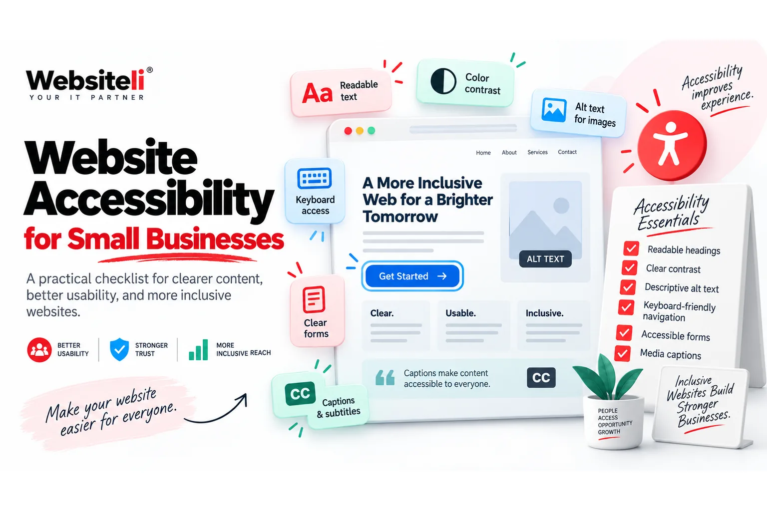
- Start accessibility work with the customer journey: reading, navigating, completing forms and understanding feedback.
- Readable text, sufficient visual distinction and a logical heading structure make pages easier to use for many visitors.
- Important actions should be usable with a keyboard and should have a visible focus state.
- Images need useful alternative text when they carry meaning; decorative images should not create noise.
- Forms need clear labels, understandable errors and confirmation that explains what happens next.
Key takeaways
- Fix the most important customer paths before polishing secondary pages.
- Test with a keyboard, zoomed text and real form submissions.
- Use semantic headings, descriptive links and meaningful image alternatives.
- Treat accessibility as ongoing quality work, not a one-time badge.
- Prioritize issues that block understanding or completion of a business-critical action.
Start with the customer journey, not the checklist
Accessibility becomes manageable when you begin with real tasks. Can a visitor understand the offer, move through the navigation, find contact information, complete the main form and recognize whether it succeeded? Review the pages that matter most to enquiries, bookings and customer support first. This keeps the work connected to business value and helps you prioritize barriers that prevent people from completing an important action.
Make text and structure easy to understand
Use clear language, descriptive headings and a logical heading order. Keep body text readable, avoid placing essential information only inside images, and make sure important controls remain distinguishable from their surroundings. Visitors should not need perfect vision, a large screen or prior knowledge of your site to understand where they are. When content is easier to scan and interpret, it also tends to support better general usability.
Make navigation and actions usable without a mouse
A visitor should be able to move through menus, links, buttons and form fields with a keyboard. Focus should remain visible so the person can see which element is active. Avoid interaction patterns that trap the visitor inside a menu, popup or widget. Test the page yourself with the Tab key and activate important controls without touching the mouse. If the main enquiry path breaks, treat it as a high-priority website issue.
Give images, buttons and links enough meaning
Alternative text should communicate the purpose of an image when that image contributes information. Decorative visuals usually do not need a verbal description that distracts from the page. Button and link text should explain the action or destination rather than relying on vague phrases such as 'click here'. Icons that perform an action need an understandable name. The goal is to preserve meaning even when someone experiences the interface differently from the original visual design.
Make forms understandable from start to finish
Forms are common failure points because they combine labels, instructions, validation and follow-up. Every field should have a clear label, required information should be understandable, and errors should explain what needs to change. Do not rely on colour alone to communicate an error. After submission, confirm that the message was received and explain the next step. Test the form on mobile and desktop and verify that the enquiry reaches the intended recipient or system.
Test accessibility as part of normal website maintenance
Accessibility is easier to maintain when it becomes part of ordinary QA. Re-test key journeys after design changes, new plugins, content updates or form edits. Include keyboard use, zoomed text, heading structure, images, links and forms in recurring website checks. Automated tools can help find certain issues, but they do not replace human review of whether a page actually makes sense and can be completed. Websiteli can include accessibility-oriented checks within website maintenance or a focused website redesign.
Business websites · Website maintenance · Website redesign · Services and pricing · Contact Websiteli